


By 2025, the Kitsap 911 CENCOM website was not fit for purpose. It was slow, broken in places, hostile to keyboard navigation, and months away from missing a federal accessibility deadline.
Kitsap 911 answers every emergency call they get. When they put out a call to fix their site, we answered it. What started as a conversation about accessibility grew to include every aspect of the site, including its design, its organization, and the platform underneath. We created a site that is now more usable and delightful to our client and the community they serve. We got there because, with us, the process is the product.
Where it started
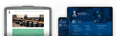
The original site was unmanaged WordPress on GoDaddy with the problems these sites often accumulate. Pages took seconds to load or were broken, and none of it worked well on a phone.
The DOJ Title II web rule set an April 2026 deadline for some public agencies to meet accessibility goals. Kitsap 911 read it as applying to them immediately. From our work with other clients, we knew their real deadline was a year further out. We built with April in mind anyway, but I wanted to give them room to review at their own pace instead of frantically trying to meet a date. I'm glad we could take that stress off the table—I think it led to a more thought-through result than if we had rushed.
Our formal audit confirmed key accessibility issues, including these that you should watch for in your own site:
- Broken keyboard interaction from carousels and mouse-only menus
- Text and background styles that made copy hard to read
- HTML used for decoration instead of structure
- Media with no alt text
- Form fields with no labels
- Missing landmarks
- Links that said “click here” and nothing more
Understand the why before the what
Kitsap 911 had met internally to give us a head start, resulting in a list of concrete changes down to specific new menu items. It was useful but prescriptive. It tried to define the end result without asking the questions that would have led there.
So in February, we ran a design meeting with a handful of Kitsap 911 staff. None of them were designers, which is exactly why I wanted them on the call. I asked design-adjacent questions instead. “How does the building feel to work in?” “What do you actually do all day?” “What brings you back in the morning?” “How do you think the public sees you?”
Staff volunteered specific visual ideas along the way and we wrote them down, but what I was really chasing was the core ethos so we could build a framework to defend every decision that came after it. The themes that came out were communication, community, and humanity, and underneath them focus, controlled chaos, perseverance, compassion... and coffee.
A few visual motifs emerged with them: lines (headset cords, sight lines between radio towers), triangles (the logo, the towers' trusses), and dark blue (the dispatch floor sits under deep royal blue light in a room the team keeps dark).
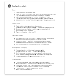
Four days after the design meeting, we delivered a design brief and an evaluation rubric with accessibility written in from the start. We worked through mood boards and evaluated them against the rubric, so feedback stopped being “I'm not sure about the blue” and turned into “how does this meet the criteria?” That moved faster, and it took personal taste out of the argument. I think we ended up with a better site for it.
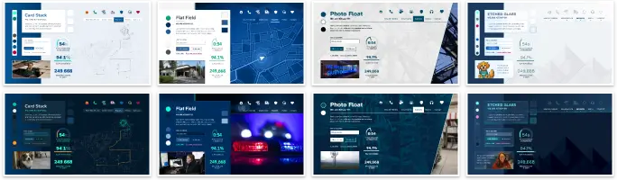
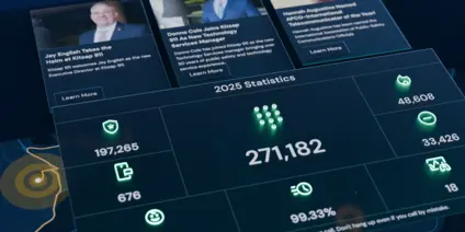
We landed somewhere between “Etched Glass” and “Card Stack” in a universal dark mode. It came out intentionally a little skeuomorphic, mimicking the real-world textures the design world largely considers dated (but which we think is making a small resurgence). We gave the site depth and treated the line and circuitry motifs like physical materials, and we did all of it inside the rubric's contrast and legibility rules.
What you see is what you mean
The old site kept its content in free-form pages full of editor-driven formatting, and meeting entries lived in tables someone had to update by hand with great frustration. Most of that content (meetings, contacts, awards, press releases, incidents) should be structured instead by consistent schemas. So we went with a structure-first system instead of one where everything is a page. For simplicity and security, we arrived at a headless setup with the content and processing (Strapi) separated from the front-end application (Next.js). This is unlike WordPress and other traditional platforms that mix the two and make security more difficult.

We're not fans of vendor lock-in. Nevertheless, for the client's convenience we set them up on the “vendor-prescribed” hosts Strapi Cloud, Vercel, and Algolia. We made sure that any of them can be switched out as needed without having to perform a costly and complicated migration.
Accessibility from the start
Accessibility is not clever work, and clever isn't what you want from a public safety site. But that doesn't mean it needs to be a slog. With the knowledge of what makes for a usable and accessible site from the beginning, and by following an atomic process, we pretty much got compliance for free.
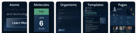
We checked the design system of colors and fonts early so it didn't have to be undone at the end of the project. But even if it had to be, using an atomic process meant that we could have gone back and changed things without having to completely rebuild the system each time. The client told us most of their visitors are on a PC, but we built mobile-first anyway. Starting from the most constrained case and enhancing upward is the same discipline that serves a screen reader, a keyboard, and a resident on an old phone.
As much expertise as went into building it, we still checked our work the way the site really gets used. I paired automated tools like axe with manual testing, then listened to the whole thing with my eyes shut. A site can ace every automated check and still be miserable to sit and listen to.
Solid structure leads to high performance
Next.js hosted on Vercel draws from Strapi hosted on Strapi Cloud. Pages are pre-rendered and served from cache. Assets are optimized and loaded progressively. Third-party scripts are down to almost nothing. Pages that used to take several seconds now render in under 200ms.
Speaking of being accessible...
How we talked to each other was as much a part of the process as anything we built. Most of our communication ran through Teams, in DMs and channel chats. The whole client team could reach anyone on our team directly with no ticket or status call. We answered questions in minutes and made decisions where the work was described. I led the project end to end, so the client always knew where they could go. Charles Leinas, our account executive, was just as reachable for business and contract questions, though with our flexibility and no change orders, there wasn't much to hammer out.
“The process is the product”
We don't have our clients sign a rigid spec on day one and then generate a change order for each surprise. That kind of behavior gives public contractors a bad name. We pin down what the project is for and leave the details free to move while everyone keeps learning. Three significant things shifted after discovery. Not one of them became a change order, because not one of them was a change. Each was a goal we had already agreed on that came into focus.
Modeling content by meaning
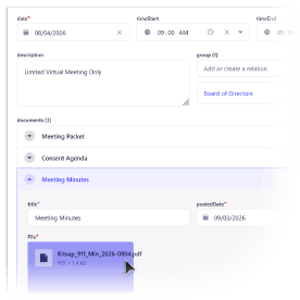
Structured frameworks let us define content by what it is rather than how it is presented. An editor defines what a meetingis, its date, agenda, recording, and attachments, and the front end works out how it looks. Press releases, board members, employee recognition, reports, and contracts all behave the same way. No one can break the layout, orphan a heading, or quietly publish an untagged PDF, because there is simply nothing to break.
Reshaping mid-stream
Because the content was structured and the navigation was just data, the site's shape stayed soft while we built it. Kitsap 911 reworked the categories and regrouped sections themselves right in the CMS while we advised. A rigid spec would have called that scope creep, but for us it's just being responsive to our client.
“”Working with D2 has increased our workflow efficiency greatly. What used to take 10-15 minutes surfing through clunky raw HTML files now takes seconds. Ever since we upgraded to a content management system, maintaining our website and making changes on the fly has never been easier. Thank you, D2!
Rebuilding public records
The process for public records requests was what changed most from the original plan. Previously, requests were tracked by email with no guaranteed delivery and no audit trail. For an agency whose records a court case could hinge on, that wasn't good enough.
The original plan was just to embed their existing form, but once I got my hands dirty with the problem, I knew it wasn't the right way. Instead, we merged the public and member-agency forms into one and routed notifications through the agency's own Microsoft 365/Graph connection so mail comes from their domain rather than an anonymous SMTP gateway that could get caught in spam filters. Copies of requests are now stored securely and are readable only by employees with the appropriate roles.

The same budget discipline helped us add two-factor authentication. With this one simple feature locked behind enterprise gates, we opted to implement it directly using well-tested open-source libraries. None of this was in an “original scope,” still none of it became a change order.
A smooth transition to launch
The existing website did not have a strong content organization model. Most everything-is-a-page websites have a tendency to collect content wherever it fits. So when we take on a web project, we often engage the client in an information architecture workshop to categorize and prioritize content so it can be organized appropriately for visitors. That means we don't “lift and shift” pages as they are, and some old URLs have to go.
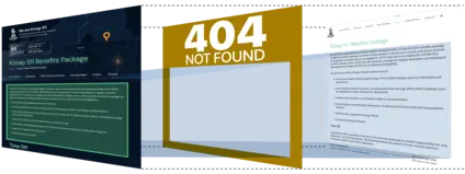
Having all the pages complete and moved would block a website launch. We planned to take the pressure off by using the old site archive as a backstop. The site would intercept a 404 and look for the content on an archive site. If found there, it would extract the main body and restyle it to match the main site with a disclaimer banner slapped on the top. With this setup, the content transition could wait and the client could focus on doing it right.
We were launch-ready in April, on their original date. Kitsap 911 went public in June because they wanted to review every page carefully and had spring schedules to work around. Knowing the real deadline is what made that possible. That's what the room we built them at the start was always for.
“”Working with D2 to create our new website was a great experience. Public safety technology requires a high degree of reliability, security, and performance. Daniel and his team provided all three for our new website. Their thoughtful design practices have both modernized and greatly improved Kitsap 911's web presence.
They own the site
We believe the quality of the work should be the differentiator, and that vendor lock-in is unethical. So we set up Kitsap 911 to own everything the site runs on, including the domain, the hosting accounts, and the code repositories. If they wanted to run it without us tomorrow, they could.
They kept us on as their maintenance partner anyway. Just like Willamalane Park and Recreation District, the City of Mill Creek, the City of Sammamish, and plenty of others. We don't really sell websites. Instead, we sell a way of working, run by people who know what they're doing, that keeps earning its place long after launch.
Is your website answering the call for the people who depend on it? Tell us what you're facing and we'll start the conversation there.